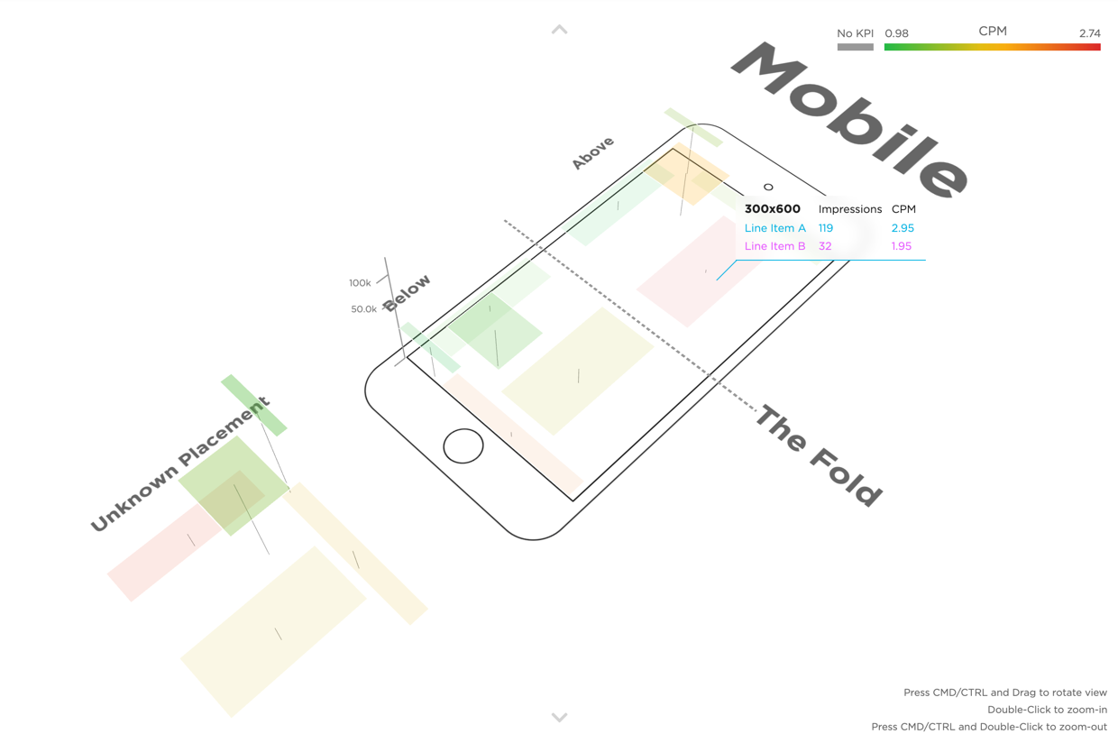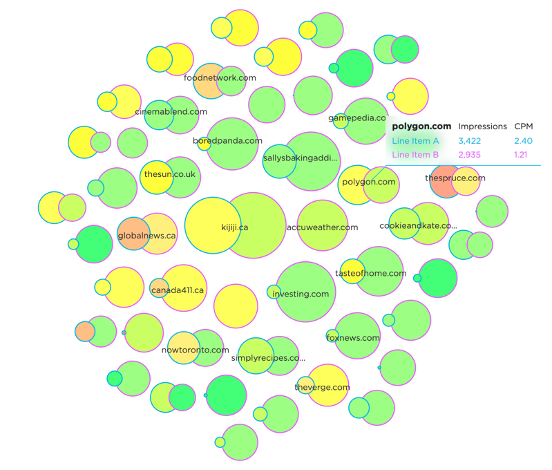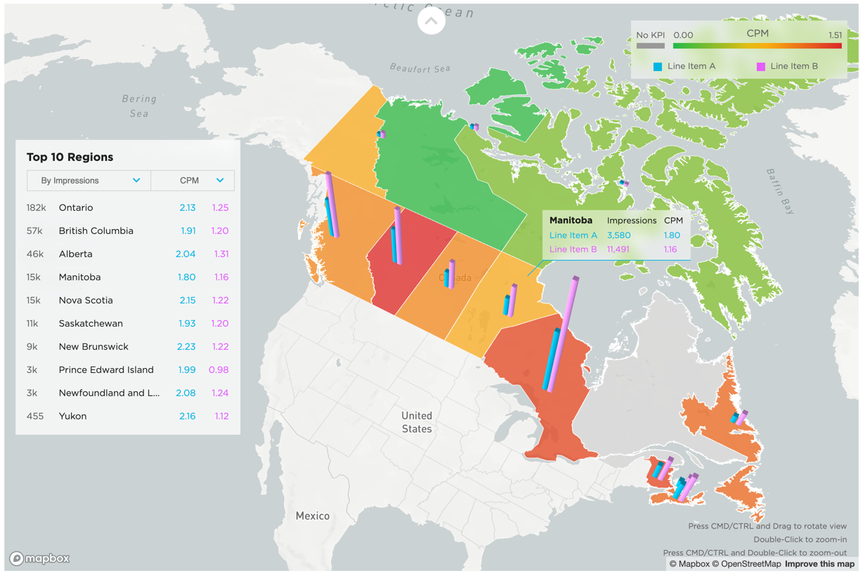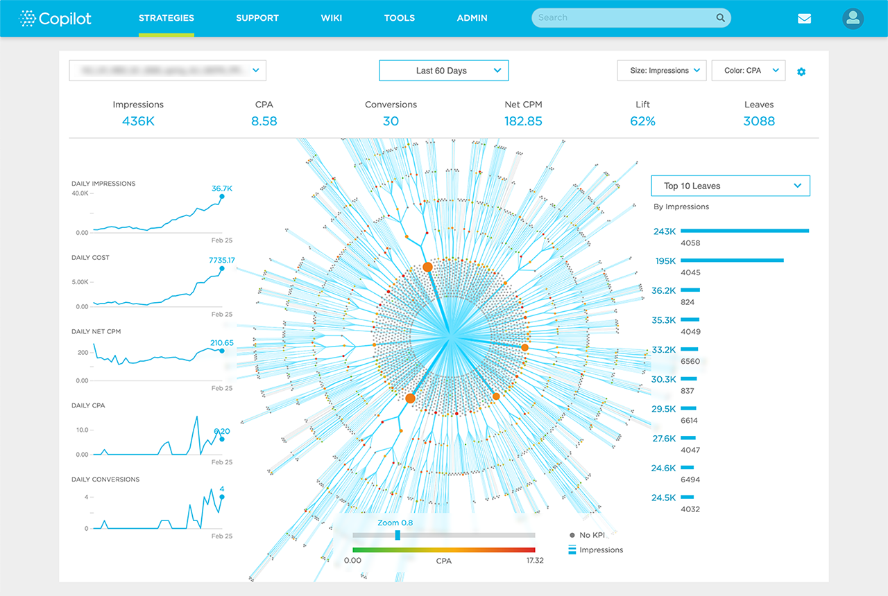
Copilot is the AI/Machine Learning group within Xaxis. As the Lead Data Visualization Designer, I work to translate AI algorithms into visual forms, building bespoke visualizations that help machine communicates with people.
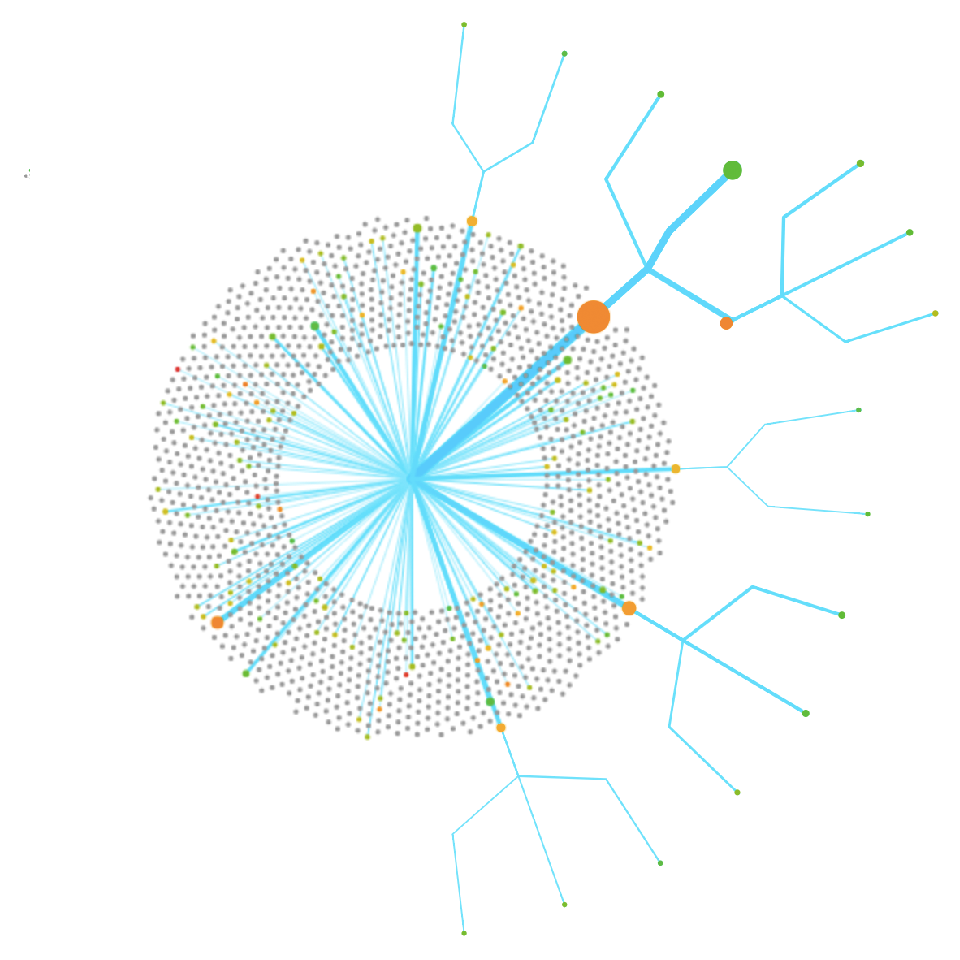
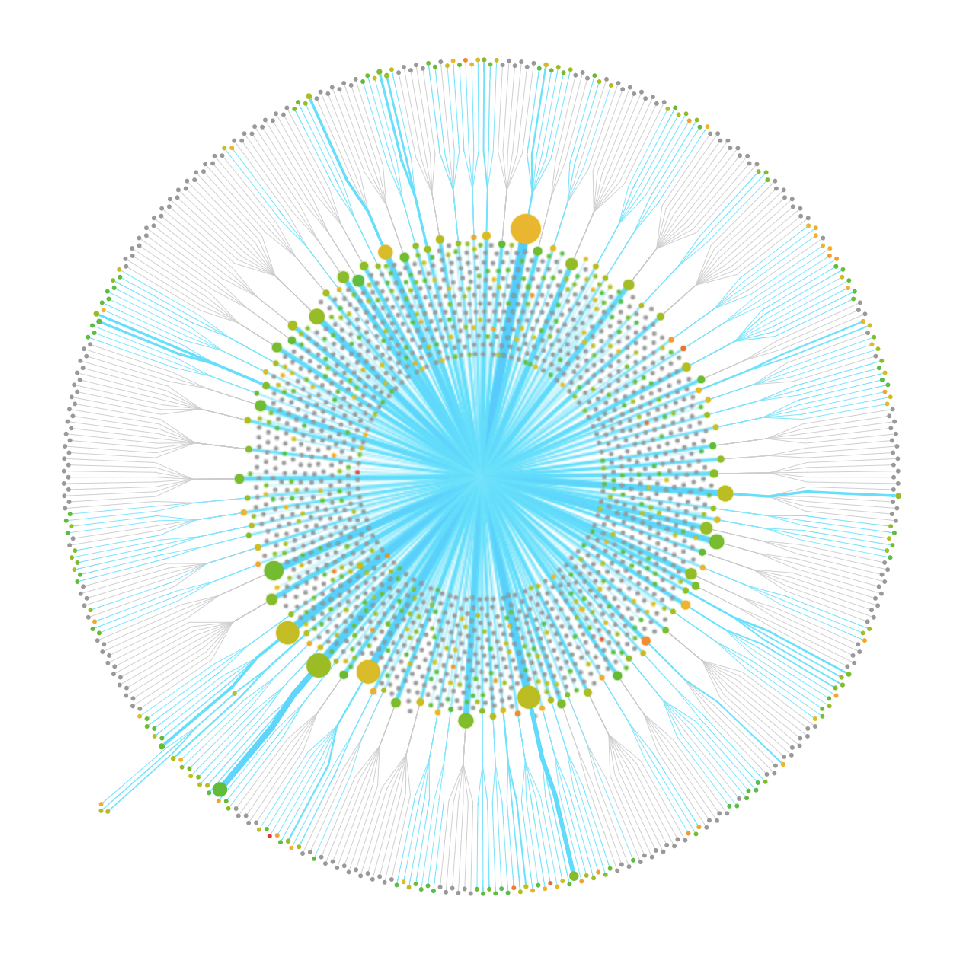
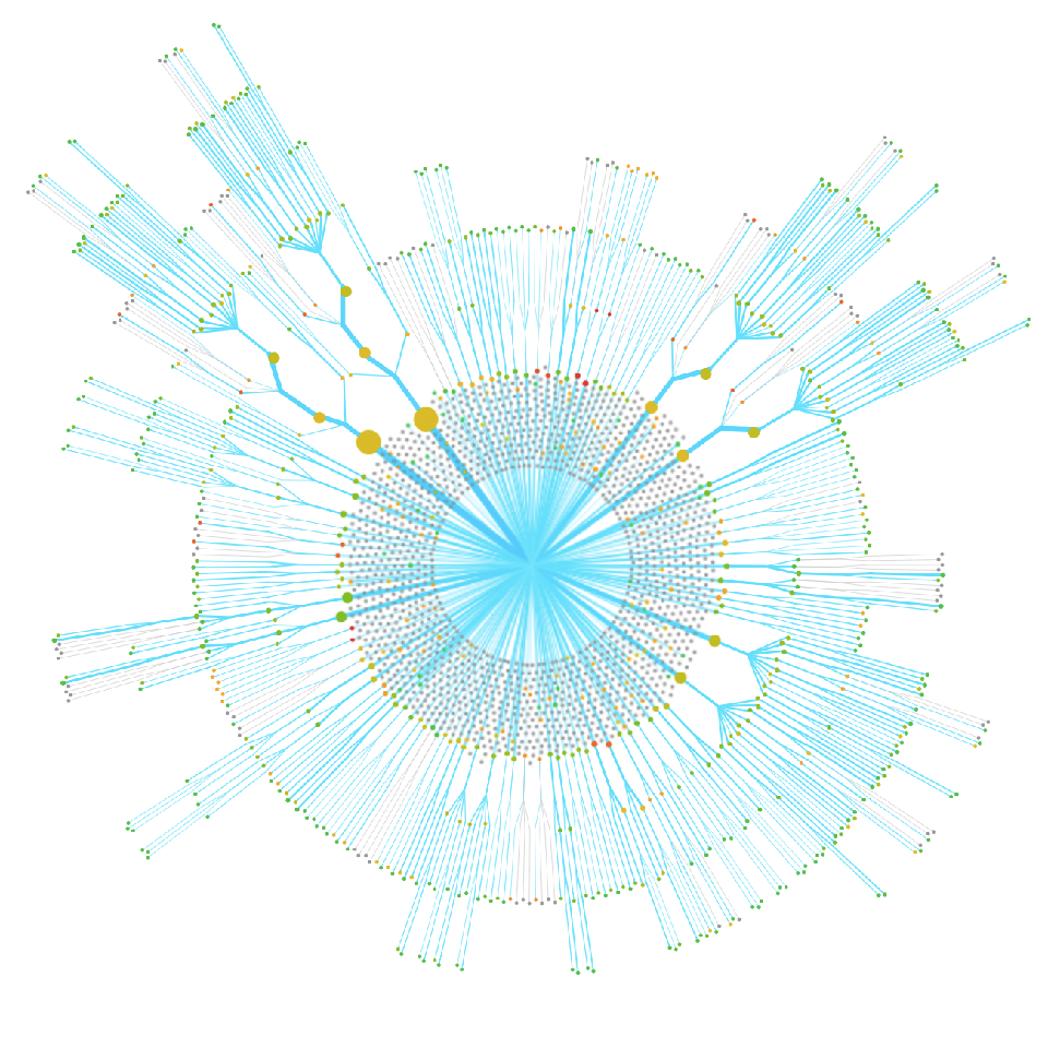
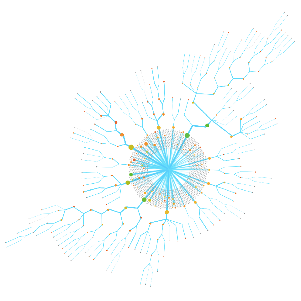
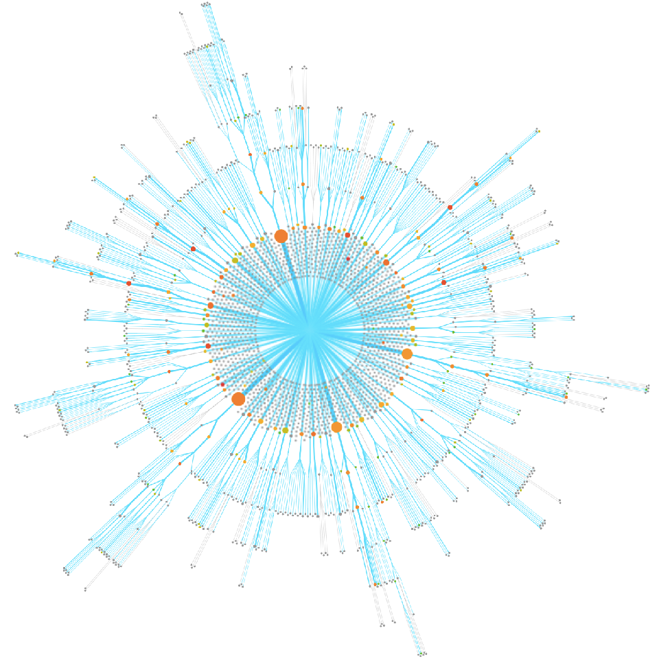
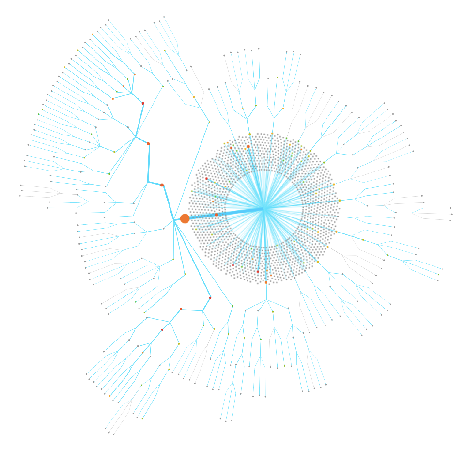
Data visualization is an art form as much as it is a visual tool. Despite protest from some within the data visualization community, data visualization's aesthetic qualities is undeniable.
Since the begining, beautiful visualizations have been coveted as objects of art. It is in many ways the precursor to computer generated art, where data, numbers, and formulas inform shapes and colors.
Practitioners of data visualization should consider artfulness in their work. Being artful doesn't diminish the value of a visualization, but instead allow it to transcend the data and captivate the spirit.
At the heart of a visualization is the data. The source of truth and knowledge.
A good visualization communicates this knowledge without distortion or prejudice, and guide the viewers toward the truth within. Data visualizations that are devoid of meanings, then, are just pretty pictures.
One of the most effective way to communicate knowledge is through storytelling. Narratives are how people make sense of the world, and there is an opportunity for data visualizations to visually tell the stories of the data.
Using shapes, colors, spatial relationships, motion and sound, data visualizations can be as effective and engaging as any visual medium in storytelling.
